I saw the news that the Bangko Sentral ng Pilipinas (BSP) approved the name change of Seabank to MariBank. To be honest, I always disliked the SeaBank logo. I thought it was a bit tacky, and its strong resemblance to Shopee’s logo: that large orange shape with a white “S”, made it visually confusing especially as app icons.
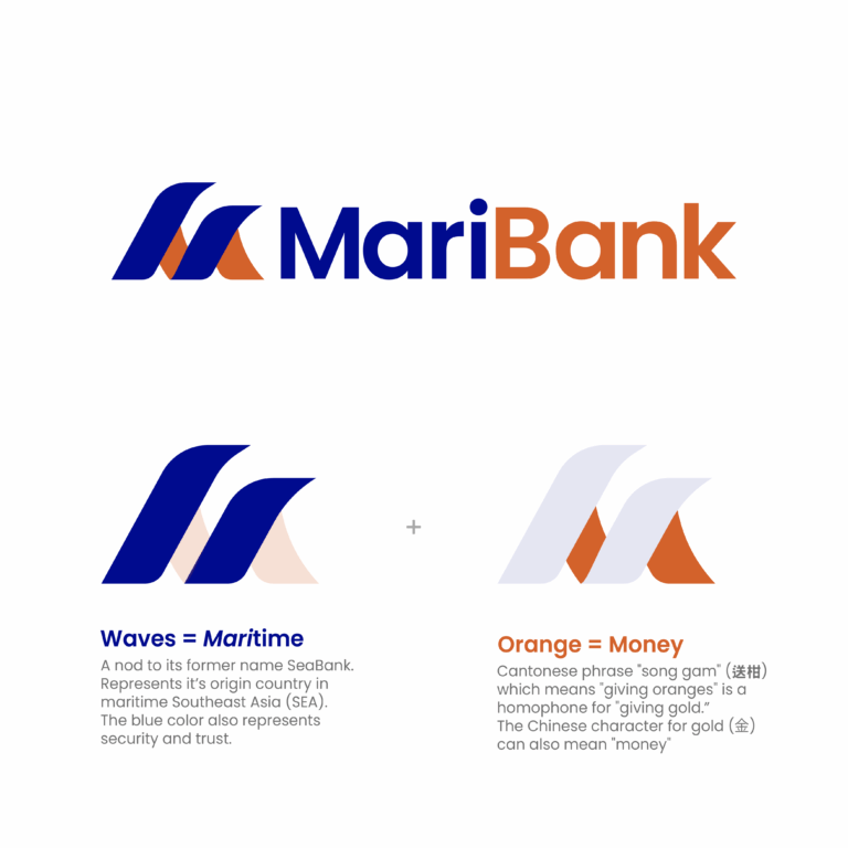
Upon seeing the news, a new design immediately came to mind. I grabbed a pencil, sketched out a concept, and then brought it to life in Adobe Illustrator. The final design features two interlocking wave shapes that form a bold “M.” The symbolism came naturally: the waves represent the name “Mari” (maritime), and the vibrant orange hue continues the cultural narrative of “gold” and prosperity, a nod to both Chinese tradition and the brand’s established color. My cultural background definitely helped me form ideas.
Design Details
🌊 Waves = Maritime Origins
A nod to its former name SeaBank and its parent company, Sea. It represents its origin, Singapore, situated in maritime Southeast Asia (SEA)
🍊 Orange = Money
The Cantonese phrase “song gam” (送柑) which means “giving oranges” is a homophone for “giving gold.” The character for gold (金) in Chinese can also mean “money”, the very thing associated with banks.

This spur-of-the-moment project highlights a crucial aspect of design: true innovation often comes from a simple, personal observation. My dislike for the old logo sparked a creative impulse that led to a solution that is both visually elevated and conceptually rich. It shows that a good design isn’t just a corporate mandate, it’s an intuitive blend of cultural understanding, aesthetic judgment, and a willingness to simply put pen to paper.
P.S. This isn’t a very polished output since it was a really quick one but let me know what you think!