How Ingenuity Approached its New Website as an Information, Experience, and Learning Platform
When people talk about redesigning a company website, the conversation often begins with pages.
What should the homepage look like? How should the navigation work? What should go in the hero? Which case studies should we feature? What typography should we use?
Those are necessary questions, but they are not where we started.
When Ingenuity redesigned its website, we increasingly treated the work as a product and systems-design problem rather than a page-design problem.
The website needed to represent what Ingenuity does, how its capabilities relate, the problems clients are trying to solve, the evidence behind our work, the ideas we have developed through delivery, and the different ways someone might enter that information.
It also needed to be maintainable.
Search engines needed to understand it. Analytics needed to measure it. Generative AI needed reliable context from it. Editors needed to manage it. Engineers needed to evolve it without constantly rebuilding templates. And the system needed to continue improving after launch.
The result was a design process that moved through several connected layers:
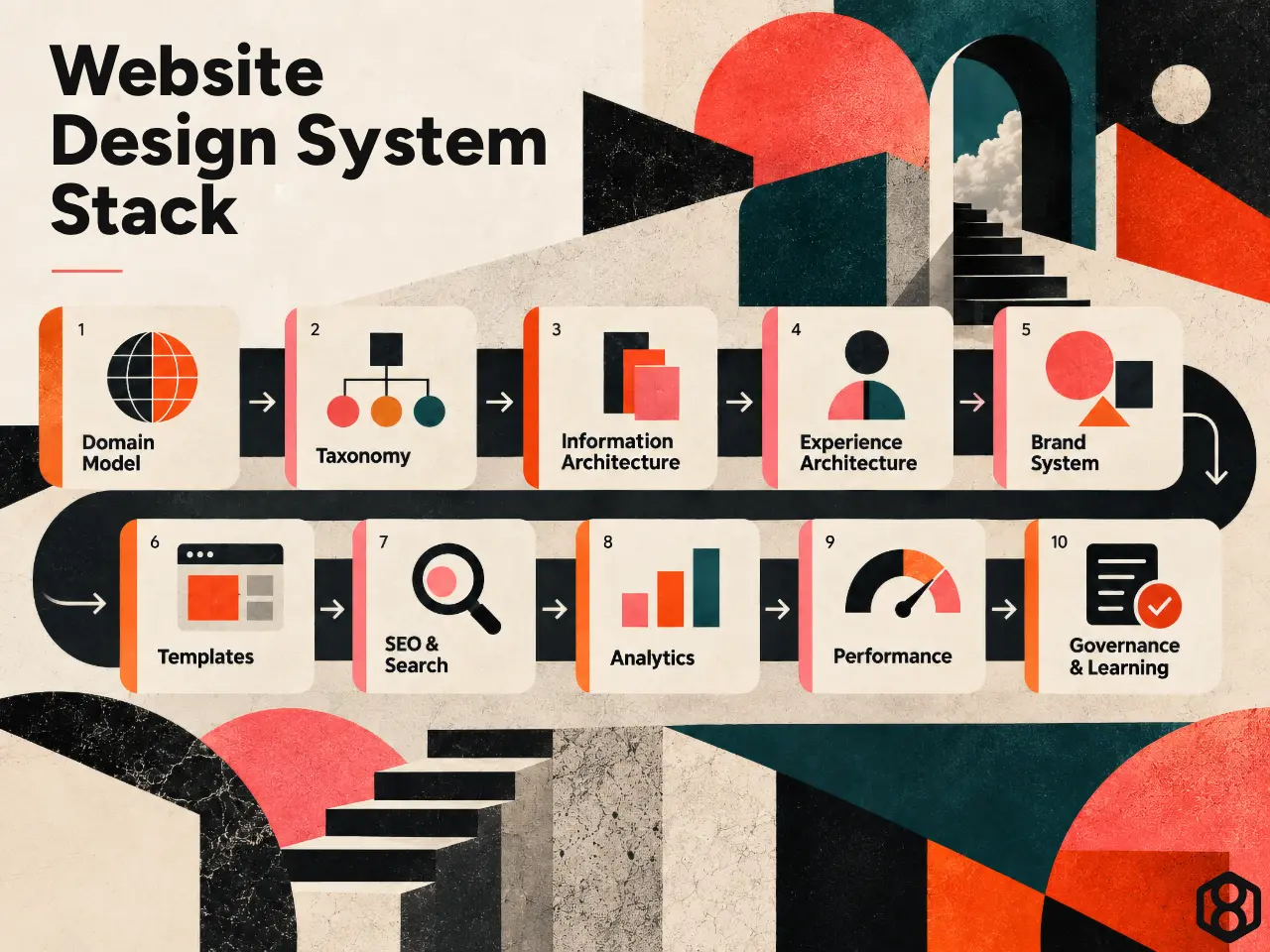
For junior product designers and software engineers, the interesting part is not the specific Content Management System (CMS) implementation.
It is how decisions at each layer affected the layers above and below it
1. We Started by Asking What the Website Actually Represented
The easiest way to make a website difficult to maintain is to model everything as a page.
A company like Ingenuity communicates several fundamentally different kinds of information.
Some content explains durable organizational capabilities.
Some packages those capabilities around a particular business problem.
Some demonstrates evidence of work already delivered.
Some captures ideas, methods, and lessons learned.
Some helps a visitor understand which direction might be appropriate for their situation.
Those things may all eventually render as webpages, but semantically they are not the same thing.
We therefore started by defining distinct content roles.
At a high level:
- Services represent persistent organizational capabilities.
- Solutions represent more specific ways those capabilities can be applied to a problem or engagement.
- Case Studies provide evidence of delivery.
- Insights capture analysis and perspective.
- Frameworks turn recurring lessons from work into reusable decision models.
- Other content types support authors, resources, events, and audience-specific experiences.
That distinction eventually became visible in Ingenuity’s five-service model: Custom Software Development and Engineering; Product Design, UX, and Product Strategy; AI Systems, Automation, and Decision Intelligence; Enterprise Digital Transformation; and Solutions for Regulated Industries. They are designed to work together rather than as isolated departments.
For a product designer, this is essentially domain modeling.
For an engineer, it is close to deciding which entities deserve their own concepts rather than being represented as arbitrary records.
The interface came later.
First, we needed a coherent model of the thing the interface was going to expose.
2. Taxonomy Became a Relationship Model, Not a Filing Cabinet
Once the main content types were defined, another problem appeared.
How should they relate?
A visitor might arrive because they care about AI.
Another may be modernizing a legacy application.
Another may want to improve customer experience.
Someone may need better operational visibility.
Another person may work in healthcare, financial services, utilities, education, or government.
These concerns cut across content types.
A single capability might appear in:
- a Service;
- several Solutions;
- multiple Case Studies;
- an Insight;
- a Framework;
- an industry context;
- and several desired outcomes.
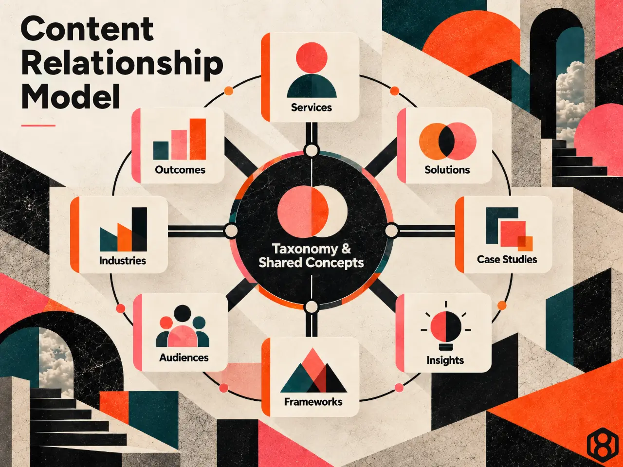
We therefore used taxonomy to create connections between information, not merely categories for editors.
This thinking is visible on the live site today. Capability and outcome pages deliberately bring together Services, Solutions, Case Studies, Insights, Frameworks, and other material around a common concept. The public site even describes these pages as showing the “relationship model working.”
This was one of the places where our experience designing products for clients directly influenced our own website.
What PickleHub taught us about relationships
When Ingenuity designed PickleHub, the problem was not simply to create individual features for courts, tournaments, clubs, payments, and players.
The value came from connecting activities that were previously fragmented: discovery, scheduling, open play, tournaments, booking, payment, and club workflows into one coherent product experience.
That same systems principle applies to content.
A visitor rarely cares that two pieces of information live in different CMS post types.
They care that the information belongs to the same problem.
This leads to a useful rule:
Taxonomy should help explain relationships, not merely organize storage.
3. The Taxonomy Evolved Toward a Living Information Model
As the project developed, we began thinking beyond conventional taxonomy.
A taxonomy tells you that two things belong to the same category.
A richer information model can tell you:
- what a concept means;
- how it relates to another concept;
- where the information came from;
- who owns it;
- which systems use it;
- what vocabulary is permitted;
- when it changed;
- and how confident we should be in it.
That thinking became part of what Ingenuity now describes as a Living Information Model.
Our public Living Information Model Canvas focuses on information entities, relationships, sources, ownership, users, decisions, quality risks, and mechanisms for change.
The important idea is that information does not become useful simply because it exists.
It becomes useful when meaning and relationships are sufficiently coherent.
That realization affected how we thought about the website.
A term like Decision Intelligence should not have a different implied meaning on a Service page, a Framework, an Insight, and an analytics report.
A Case Study connected to a capability should be connected because the evidence actually supports that relationship…not because an editor needed another card to display.
The website therefore began to function as one public projection of a broader organizational information model.
4. Ontology Studio Helped Us Make the Hidden Model Explicit
An important internal tool in this process has been Ontology Studio, a macOS application Ingenuity has been developing to model and govern organizational concepts and relationships.
Ontology Studio was not built simply as a website-management application.
Its broader purpose is to act as a governed system of record for ontology: concepts, properties, semantic relationships, metadata, definitions, provenance, lifecycle, external identifiers, usage, and change.
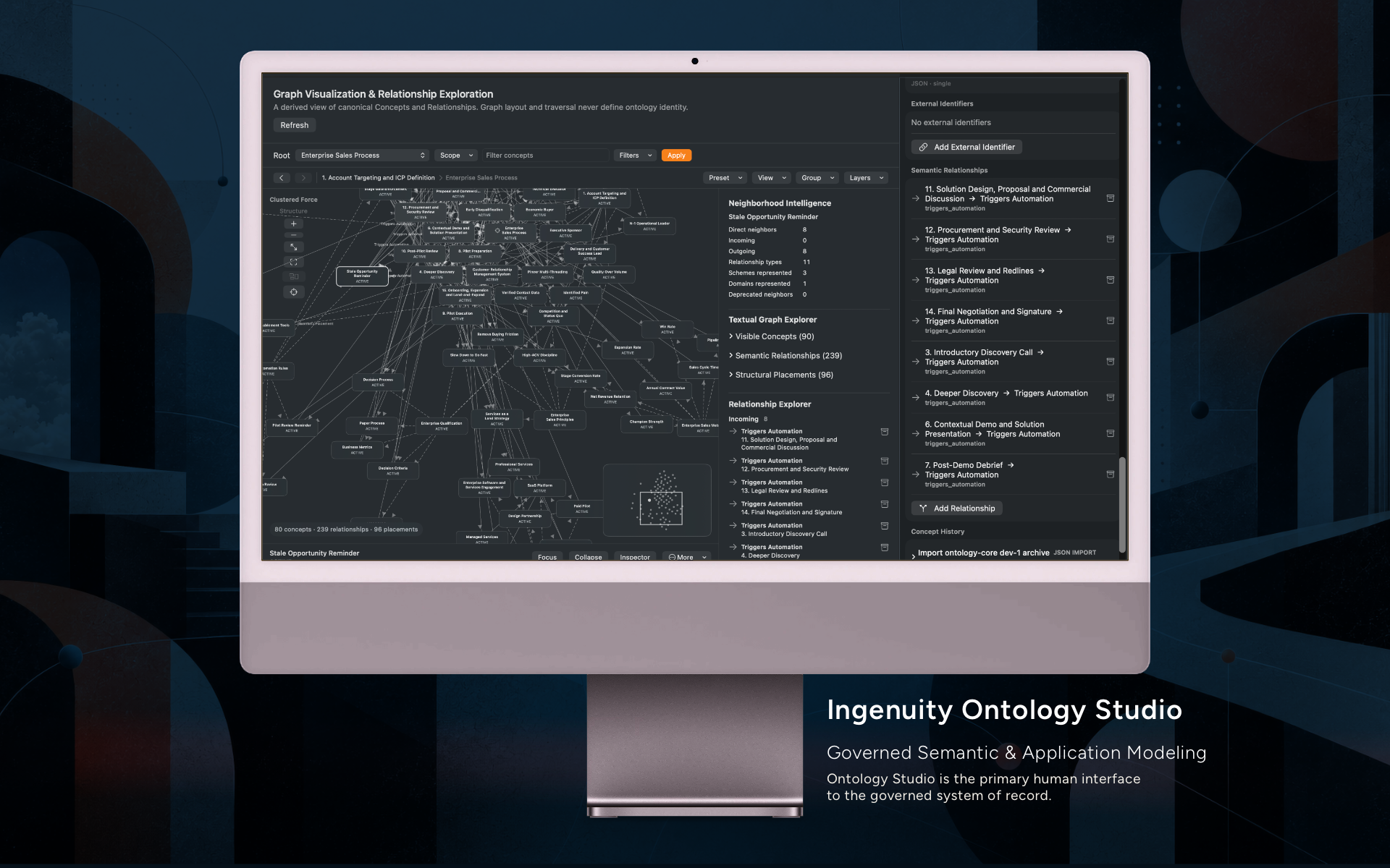
But the website provided a valuable real-world domain to explore.
A simplified way of thinking about the structure is:
Organization
    ↓
Domain
    ↓
Taxonomy
    ↓
Concept
    ↓
Properties + relationships
The website taxonomy provided useful source material because it forced us to ask questions that the CMS alone does not need to answer.
For example:
What is “Decision Intelligence”?
Is it:
- a capability?
- a topic?
- an outcome?
- a method?
- part of a Service?
- something implemented through particular Solutions?
- something demonstrated by certain Case Studies?
The CMS can store a taxonomy term named Decision Intelligence.
Ontology Studio makes us ask what that term means.
That distinction became increasingly important.
The CMS stores content. The ontology governs meaning.
They overlap, but they solve different problems.
5. Ontology Studio Also Taught Us Something About Interface Design
As our ontology work became more sophisticated, we encountered a familiar problem.
A rich semantic graph becomes overwhelming very quickly.
If every concept, property, relationship, provenance link, and associated system is displayed simultaneously, the result may be technically complete but practically unusable.
That led us to explore features such as:
- filtering;
- graph presets;
- grouping;
- progressive disclosure;
- semantic zoom;
- relationship inspection;
- concept catalogs;
- provenance;
- and application-specific views.
That work reinforced an important lesson that also influenced the website:
Complexity in the underlying model does not require complexity in the interface.
In fact, a richer underlying model often allows us to produce simpler interfaces.
The public website does not need to show visitors a giant knowledge graph.
Instead, each surface presents a useful projection.
A Service page presents one view of the model.
A Solution presents another.
An audience page presents another.
A topic page gathers another subset.
A Case Study provides evidence around part of the graph.
The model can remain complex while the interface exposes only what is relevant to the current decision.
That is essentially what good product design does everywhere.
6. We Designed Navigation Around the Visitor’s Problem, Not Our Org Chart
An internally logical information architecture does not automatically produce a good customer experience.
Technology companies often organize websites around disciplines:
- design;
- engineering;
- cloud;
- data;
- AI;
- consulting.
The problem is that buyers often do not know which discipline they need.
They know something like:
“Our platform is becoming difficult to change.”
“We have plenty of data but decisions are still slow.”
“Customers are struggling with this journey.”
“We want to use AI but aren’t sure we’re ready.”
“Operations still depend on spreadsheets and manual coordination.”
This led us to distinguish between two things.
Information architecture
How Ingenuity’s capabilities and knowledge are structured.
Experience architecture
How someone moves through that structure from the perspective of their own situation.
That is why parts of the website evolved toward needs-led navigation rather than expecting visitors to diagnose which Ingenuity service they require.
The current homepage summarizes the idea simply: start with the situation, rather than forcing a predefined service.
The service architecture remains important.
But it is not the visitor’s responsibility to understand our organizational model before we can help them.
7. Product Validation Experience Influenced How We Designed the Site
Another influence came from the way we approach early-stage product work.
Ingenuity’s Product Validation Decision Canvas starts with the decision that needs to be made, then connects that decision to assumptions, evidence, users, experiments, and explicit criteria for proceeding, revising, or stopping.
That matters because teams can produce a large amount of discovery output without actually reducing uncertainty.
We applied a similar mindset to the website.
We did not assume that:
- the first navigation model was correct;
- the first homepage structure was final;
- the first terminology was optimal;
- the first CTA hierarchy would work;
- or the first content model would survive contact with real publishing needs.
We treated these as propositions we could refine.
This way of working is also visible in Ingenuity’s early work with Grin, where working applications were used to test product directions and learn from actual use instead of treating the first product hypothesis as fixed.
The broader lesson for junior designers is:
A prototype is valuable when it changes what you know, not merely when it looks convincing.
8. The Brand Became a System of Behaviors
Only after the underlying architecture had become reasonably coherent could visual design do its best work.
Ingenuity’s brand is built around ideas such as:
- craft;
- precision;
- engineering quality;
- intelligence;
- systems thinking;
- partnership;
- and learning.
Those principles are also reflected in the company’s own history: craft, systems thinking, partnership, and learning are identified as recurring ideas across the organization.
We wanted those ideas to appear in more than a logo or color palette.
They needed to affect:
- typography;
- whitespace;
- visual hierarchy;
- information density;
- imagery;
- transitions;
- animation;
- interaction;
- and how complexity was presented.
Motion graphics, for example, were increasingly treated as an explanatory language rather than decoration.
Animations could communicate:
- systems assembling;
- capabilities connecting;
- information moving;
- transformation occurring;
- or pathways opening.
The question became less:
“How can we make this section impressive?”
and more:
“How should an Ingenuity system behave visually?”
That is a much more useful role for brand in product design.
A mature brand constrains decisions.
9. Templates Were Designed Around Semantic Jobs
Once the information model and design system existed, we translated them into reusable CMS templates.
We use the CMS as the publishing environment, with structured content, taxonomies, and a custom child theme controlling much of the presentation and behavior.
But the important decision was not the CMS.
It was deciding what each content type must accomplish.
A Service explains a durable organizational capability.
A Solution describes a more bounded way to solve a problem.
A Case Study must provide evidence.
An Insight supports editorial reasoning.
A Framework teaches a reusable method.
A Session or Briefing helps someone engage with a particular subject.
That creates a stable semantic contract for each template.
This gives both designers and engineers leverage.
If every Case Study shares a coherent information hierarchy, we can later improve:
- SEO;
- performance;
- accessibility;
- analytics;
- related content;
- hero behavior;
- visual hierarchy;
- or structured metadata
across the entire family.
Engineers will recognize the idea immediately.
It is the content equivalent of preferring reusable interfaces and components over repeated one-off implementations.
10. Experience Taking Over Existing Products Reinforced the Need for Consistency
Our work with Fruit Street was particularly relevant here.
Rather than creating a new application from scratch, Ingenuity assumed responsibility for an existing digital-health product and marketing site. The work required understanding an inherited system, stabilizing a complex handoff, preserving product and UX continuity, and coordinating delivery without unnecessarily rebuilding everything.
That kind of engagement teaches an important lesson:
Consistency is operational infrastructure.
When patterns, terminology, templates, ownership, and system boundaries are clear, another person can understand and extend the product.
When everything depends on the original designer remembering why a particular page works differently, the system becomes fragile.
We wanted the new website to be something future teams could understand—not just something the original team could operate.
11. Structure Only What Needs to be Structured
There is a risk in all of this systems thinking.
You can over-model the product.
If every paragraph becomes a field and every relationship requires governance approval, editors lose the ability to tell a story naturally.
But the opposite extreme is also dangerous.
If every page is completely free-form, the information model gradually disappears.
Our working principle became:
Structure the information the system needs to understand. Leave room for expression where people need to communicate.
That is especially important because the website is no longer consumed only by human visitors.
Its information is interpreted by:
- search engines;
- analytics systems;
- APIs;
- recommendation logic;
- AI systems;
- and internal tools.
A human may understand that two visually similar paragraphs describe different things.
A machine benefits from more explicit semantics.
Good content architecture has to serve both.
12. Generative and Agentic AI Accelerated the Work – But was Not Allowed to Become the Source of Truth
Generative AI played a substantial role throughout the redesign.
We used it to accelerate tasks including:
- information-architecture exploration;
- taxonomy analysis;
- content modeling;
- naming;
- copy refinement;
- SEO metadata;
- interaction concepts;
- code generation;
- debugging;
- documentation;
- analytics analysis;
- performance diagnosis;
- and visual exploration.
This dramatically reduced the cost of iteration.
An idea that might previously have taken hours to prototype could often be explored in minutes.
But that introduced an important risk.
A language model is extremely good at producing plausible structure.
Plausible is not the same as correct.
An AI system can easily infer a relationship that sounds reasonable but has never actually been defined by the organization.
That led us to an increasingly important principle:
Use Generative AI for interpretation and exploration; use governed systems for organizational truth.
This is one of the reasons the Living Information Model and ontology work became important.
The better our underlying context became, the more useful AI became.
13. AI-native Design is Not the Same Thing as Adding a Chatbot
This experience changed our view of what an AI-native website could mean.
A chatbot is only an interface.
The deeper question is whether the information behind the interface can be understood reliably.
A system becomes much more AI-ready when:
- entities have explicit meaning;
- relationships are modeled;
- important vocabulary is governed;
- provenance exists;
- ownership is known;
- canonical sources are identifiable;
- APIs expose structured information;
- analytics have defined semantics;
- and AI is given appropriate context.
The conversational interface can come later.
If the underlying information is incoherent, adding a sophisticated language model merely allows the system to misunderstand it more fluently.
14. SEO Became Another Information-Quality Problem
Search optimization followed the same philosophy.
We use SEO plugins, but we did not think of SEO simply as completing a list of fields.
The harder problem was consistency between:
- page purpose;
- titles;
- URLs;
- canonical relationships;
- structured content;
- internal linking;
- taxonomy;
- legacy URLs;
- redirects;
- and search intent.
The relationship model helped.
Search engines can better interpret a coherent ecosystem in which Services represent capabilities, Solutions represent applications, Case Studies provide evidence, and Frameworks and Insights expose the thinking behind the work.
The site’s Frameworks library is a good example. Rather than existing as miscellaneous blog content, frameworks are explicitly presented as tools for clarifying trade-offs, exposing assumptions, connecting evidence, and improving decisions.
Semantic clarity helps people.
It also helps machines.
15. We Treated Analytics as Another Semantic System
Analytics was one of the areas where the same ideas became especially important.
It is very easy to instrument a website.
It is much harder to ensure that the resulting numbers mean what people think they mean.
For example:
A click is not necessarily intent.
A form start is not a submitted inquiry.
A GA4 key event is not automatically a lead.
A page view is not evidence that content was valuable.
We therefore developed a governed measurement architecture.
Different systems have explicit responsibilities.
The CMS and SEO tooling manage publishing identity and metadata.
Google Tag Manager handles governed interaction instrumentation.
GA4 and Search Console provide behavioral and search evidence.
PageSpeed provides technical evidence.
Our internal Analytics Foundation provides additional site context.
And a native macOS application, Ingenuity Analytics, brings those sources together for analysis and decision support.
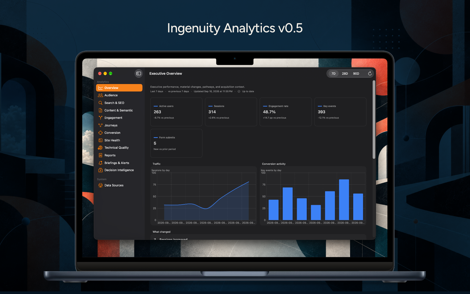
Since Ingenuity’s team works in a hybrid arrangement and from many different locations we’ve made access to key analytics information available across all of our operational surfaces.
The architecture reflects a principle also used in Ingenuity’s Unified Operational Dashboard solution: begin with the decisions people need to make, then determine which signals, definitions, context, ownership, and workflows are necessary to support them.
A dashboard is not valuable merely because it contains data.
A metric is valuable when it can safely influence a decision.
16. The Decision Intelligence Delivery Loop Became a Useful Way to Manage the Website
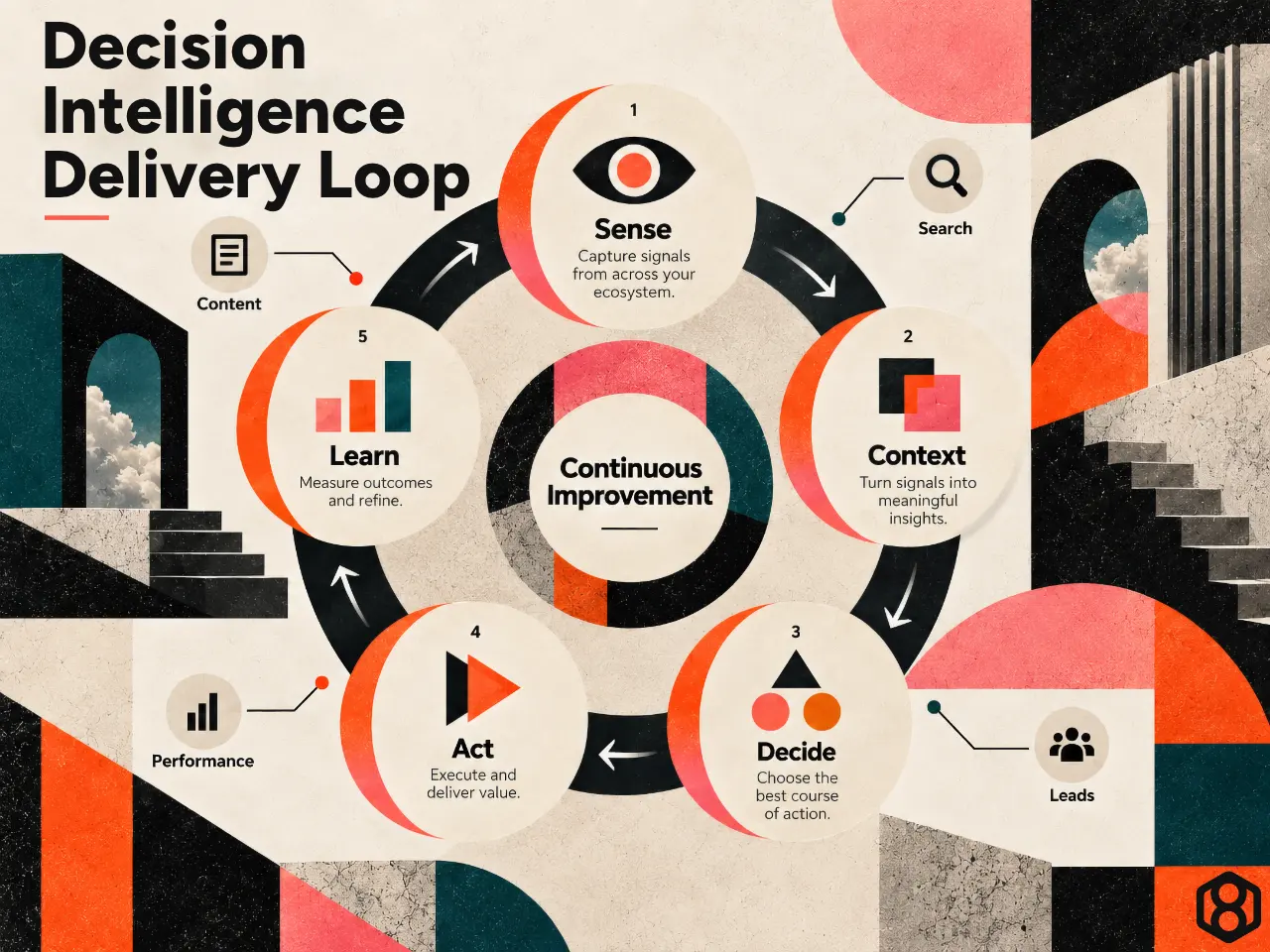
Ingenuity’s Decision Intelligence Delivery Loop describes five connected stages:
Sense → Context → Decide → Act → Learn.
That framework has become useful for thinking about website management.
Sense
Something changes.
Search traffic falls.
Engagement improves.
A page becomes slow.
Visitors repeatedly enter an error path.
A form is not converting.
Context
What does the signal actually mean?
Was the site recently deployed?
Did instrumentation change?
Is the sample large enough?
Is this a real user outcome or merely an event counter?
Decide
What decision needs to be made?
Act
Change the content, navigation, instrumentation, template, performance behavior, or technical implementation.
Learn
Did the change produce the expected result?
That turns analytics from passive reporting into a learning loop.
17. Generative AI Became Part of the Analytics System Too
As Ingenuity Analytics evolved, we wanted AI to help with interpretation.
But once again, unconstrained generation was not enough.
The application produces detailed, structured reports that can be used as context for Generative AI.
We also developed different analytical lenses, including:
- Executive Performance;
- Engagement Improvement;
- Conversion and Lead Generation;
- Organic Search Growth;
- Content and Thought Leadership;
- Customer Journey and Information Architecture;
- Technical Experience and Performance.
Each lens has different evidence priorities.
More importantly, each can establish prohibited inference patterns.
For example:
The conversion lens should not equate aggregate key-event growth with lead growth.
The search lens should not interpret average ranking position without considering query mix.
The technical lens should not claim that a Lighthouse result caused an engagement change without supporting evidence.
This leads to another useful principle for junior practitioners:
A trustworthy AI system needs rules for what it should not conclude.
Prompt engineering is not enough.
Governance also requires boundaries.
18. Client Work had Already Taught Us that Data Without Action is Incomplete
This was not an abstract idea.
Many of Ingenuity’s projects involve connecting fragmented information to operational work.
The University of Zamboanga Connect App, for example, evolved into a modular campus-operations platform connecting communication, QR validation, health workflows, attendance, appointments, queues, feedback, and administrative visibility.
Similarly, SafeDavao QR had to connect citizen interactions, establishments, public-health workflows, vaccination activity, operational systems, and government decision support during rapidly changing conditions.
SafeDavao was particularly instructive because the challenge was not merely technical scale.
The system also had to account for:
- privacy;
- accessibility;
- trust;
- rapidly changing policy;
- multiple stakeholders;
- and very different levels of digital literacy.
That experience reinforces a broader principle:
Digital systems exist inside operating environments.
The website does too.
Traffic, search, content, analytics, technology, editorial practice, and organizational decisions all affect one another.
19. Performance Became a Design Problem, Not Merely an Engineering Problem
After launch, performance analysis revealed another useful systems lesson.
The homepage initially had weak mobile performance.
We improved it by treating the critical rendering path as an explicit part of the experience.
Later, Lighthouse analysis revealed similar patterns across:
- Service pages;
- Case Studies;
- Sessions;
- Frameworks;
- static pages;
- and taxonomy pages.
These pages looked different.
But underneath, they were paying for many of the same generalized CSS, font, theme, and JavaScript dependencies before useful content could appear.
The problem therefore moved from:
“Why is this page slow?”
to:
“Which shared architecture is causing several page families to behave this way?”
That shift is important.
It is also consistent with the thinking behind our Software Delivery Risk Map, which treats architecture, quality, dependencies, deployment, operations, and organizational conditions as interacting sources of delivery risk rather than searching for a single culprit.
The visible symptom might be a Lighthouse score.
The underlying cause may span several layers.
20. We Designed Performance Optimizations to Fail Toward Correctness
Performance optimization can be dangerous.
It is relatively easy to improve a benchmark by delaying or removing assets.
It is harder to do that without breaking something.
We therefore adopted a fail-closed approach in our critical-render-path work.
If a critical bundle does not meet its validation requirements, the system returns to conventional stylesheet loading rather than continuing with an unsafe optimization.
That reflects a broader engineering principle:
When an optimization fails, the product should fall back toward correctness.
This is closely related to the ideas behind Ingenuity’s Software Delivery Risk work, where rollback, dependencies, observability, release processes, and operational ownership are part of delivery reliability – not afterthoughts.
A page that loads faster but becomes unpredictable is not an improvement.
21. Launch Became a Deployment Event, Not the End of the Project
The new website launched in September 2026.
That did not mean the project was finished.
In some ways, that was when the most useful evidence began.
This affected how we interpreted analytics.
We deliberately avoided treating a pre-launch and post-launch period as if they were normal comparable weeks.
A deployment can change:
- URLs;
- redirects;
- content structure;
- metadata;
- tracking;
- indexation;
- user journeys;
- and technical performance.
Our analytics tooling therefore became deployment-aware.
The goal was to establish a clean post-launch baseline before interpreting longer-term behavior.
That is a small example of a much larger lesson:
Metrics have history.
Data does not exist independently of changes to the system that produced it.
22. The Website Now has an Operating Model
We eventually stopped thinking about the website as something that becomes finished.
Instead, it has to be operated.
Content evolves.
Terminology evolves.
Taxonomies evolve.
Search behavior changes.
New Case Studies appear.
Capabilities expand.
Analytics schemas mature.
Performance can regress.
Generative AI creates new ways of consuming information.
The website therefore requires:
- governance;
- ownership;
- versioning;
- validation;
- observability;
- deployment discipline;
- and continuous learning.
This is another area where our delivery experience mattered.
Fruit Street reinforced the importance of continuity in an inherited product.
SafeDavao showed how requirements and operating conditions can change while a system remains live.
UZ Connect demonstrated the value of modularity as new operational needs emerge.
The Living Information Model makes change itself part of the information architecture.
All of those ideas influenced how we approached the website after launch.
23. Generative AI Changed the Economics of Iteration
There is also a practical reality worth acknowledging.
AI allowed us to do more iterations.
Designers and engineers could move more quickly between:
- hypothesis;
- implementation;
- critique;
- validation;
- correction.
That does not remove the need for expertise.
It changes where expertise is most valuable.
When producing a first draft becomes inexpensive, the difficult questions become:
- Is this model coherent?
- Is this information true?
- Is the relationship real or merely plausible?
- Will this taxonomy scale?
- Is this evidence actually sufficient?
- What could this change break?
- How will we know whether it worked?
- Who owns the decision?
- What happens when the AI is wrong?
AI did not eliminate product design and software engineering.
It increased the importance of judgment.
24. The Longer-Term Architecture Extends Beyond the Website
The project gradually revealed a larger architecture.
A simplified version looks something like this:
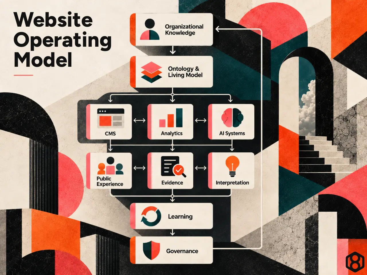
No single tool needs to do everything.
The CMS does not need to become an ontology platform.
Ontology Studio does not need to become a CMS.
GA4 does not need to become the source of product truth.
A language model should not become the authoritative repository of organizational knowledge.
Each system can specialize.
The architecture becomes powerful when the boundaries and contracts between them are clear.
Software engineers will recognize that pattern.
Good system design often comes from strong boundaries, not giant platforms.
25. What Junior Designers and Engineers Can Take From the Project
The most important lessons are not specific to the CMS or Ingenuity.
1. Model the domain before designing the screen
Understand the meaningful concepts and relationships beneath the interface.
2. Do not confuse taxonomy with navigation
The organization needs a rigorous model.
Users need understandable pathways through it.
Those are related but different problems.
3. Start from the user’s decision
Our Product Validation Decision Canvas and Decision Intelligence work both reinforce the same idea: define the decision before collecting artifacts or data.
4. Let branding constrain behavior
A brand should help determine hierarchy, density, motion, interaction, imagery, and tone…not merely colors.
5. Build templates around meaning
Reuse is strongest when it follows semantic roles rather than superficial visual similarity.
6. Model relationships explicitly
Connected systems become easier to navigate, analyze, and extend.
7. Instrument meaning, not merely interaction
A measurement system needs semantic contracts.
8. Treat performance as UX
The browser’s rendering pipeline delivers the design too.
9. Design for both people and machines
Increasingly, your information will be consumed by search engines, analytics systems, APIs, AI agents, and language models as well as humans.
10. Use AI to increase the speed of learning
Do not use it to avoid thinking.
11. Give AI governed context
Let models interpret ambiguity, but keep organizational truth anchored in authoritative systems.
12. Design for change
Governance, provenance, versioning, observability, safe fallback, and deployment discipline are product concerns.
The website is only the visible layer
The final website is what visitors see.
But underneath it is a much larger system.
There is a model of Ingenuity’s capabilities.
There are relationships between Services, Solutions, Case Studies, Frameworks, Insights, audiences, industries, topics, and outcomes.
There is a design system that translates the brand into behavior.
There are templates that project structured information into experiences.
There is an ontology effort that helps make meaning explicit.
There are search and analytics systems observing how people and machines interact with the information.
There are Generative AI systems helping us interpret, create, test, and learn.
There are governance mechanisms intended to keep all of those things coherent as they change.
That is why we no longer think of the project simply as a website redesign.
We were designing an information, experience, measurement, and learning system whose primary public interface happens to be a website.
Many of the ideas behind it were not invented specifically for our own site.
They came from designing real products and systems: connecting fragmented workflows in PickleHub, learning through experimentation with Grin, taking responsibility for inherited complexity with Fruit Street, coordinating institutional workflows in UZ Connect, building for trust and change at civic scale with SafeDavao, and turning recurring lessons into frameworks that make those patterns reusable.
The tools changed along the way.
Content Management System. Analytics. Ontologies. Generative AI.
The underlying work did not.
It was still about understanding the whole system well enough to decide what matters, making those decisions explicit, engineering them carefully, observing what happens next, and using what we learn to make the system better.
That is also a useful definition of good product work.